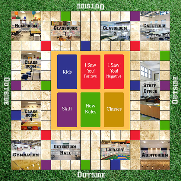
Probably the most important aspect of the Rule The School! Boardgame is the gameboard. I decided to focus on the Board Game first instead of the card game mainly because using a gameboard could help reduce the game’s complexity, do a lot of the heavy lifting for some of the mechanics, and make the game easier for younger ages to play. So with that direction, the big issue became how to design the gameboard?
My first inspiration for the board came from the classic game Clue. I liked how that board represented a building and had rooms the players could go in where the brunt of the game action took place. With that in mind, I set about designing a board that represented a school, with a number of classrooms and special rooms that would replace the room cards I had in my original deckbuilding game. So now, instead of having room cards that would be played, I could have class card, and each classroom can now host multiple classes.
The question then became what rooms would be represented and how many. I wanted at least four classrooms to represent the four major basic subjects (english, math, science, social studies). I also figured players would expect to see other rooms that are typically in schools: a Gym, a cafeteria, a principal/staff office, a library, and an auditorium. In my card game, the discard pile was referred to as detention hall. But with no need for a discard pile in the board game, how about we include an ACTUAL detention hall on the board? That would open up some new gameplay options and introduce a real consequence option (I just needed to figure out how detention hall worked. I’ll talk about that in depth in a future post). I also wanted four homerooms in the corners of the board; the game was originally planned for a max of four players, and I thought having homerooms in each corner of the board would give some strategic options for players and an ever changing dynamic for how long it took to get to certain classrooms. I planned for the amount of turns it took to get from one room to another to be a major factor in gameplay, and having different players in different homerooms was a part of that factor. So that gave ma a total of XX rooms I had to place.
Figuring out where the rooms would go and how big the rooms should be turned out to be a puzzle within itself. I wanted to have a gameboard big enough to accomodate all of those rooms and still be comfortable for the players, so I went with a larger board (18” x 18’) that I split into a grid of 1” squares. I wanted the rooms to be a nice size, but I also still needed space in between the rooms for hallways the players could traverse. At first, it was tough figuring all of that out. How big should the homerooms be? How much space should the Gym and Cafeteria take up? Where do I put the classrooms that would make sense like in an actual school? I was juggling all of that.
Then I realized I had missed a few details that needed to be accounted for. Some of the cards required the kids to go outside. That added another dynamic to the game, and I forgot to account for an outside area. So my solution was to shrink the gameboard and devote a 1-square perimeter to the outside. Then there was the issue of where the cards would go. My wife and her family are big fans of Monopoly, and Monopoly has a plastic caddy that come with the game where people can store cards. I thought having one of those would be a great idea, a plastic container with five slots for the five different kinds of cards players could draw from and keep the cards neat. Unfortunately, the game printing company I was using for my prototypes (gamecrafter.com) didn’t offer those caddies, and if they did it would have added at least a few more dollars to the final price. So that was no longer an option and I had to make room on the gameboard for the cards.
Finally, I needed a mechanism for players to utilize the staff and new rule cards. I thought it was important to keep those in the game because it added some unpredictability to the game that players would have to adapt to. My solution was to color code certain squares on the board so that when players landed on the board, they had to draw and play cards that corresponded with the colors: purple for staff and green for new rules. I then got the idea to add two more color coded spaces: one that sent players directly to detention, and one that sent players directly to homeroom. In my original rules, players had to make their way back to homeroom after completing a class, and having a way to instantly go back to homeroom would be another strategic element.

I admit my first solution to all of this was not very elegant. I had an area in the center of the gameboard big enough to fit four decks of business card-sized cards, which meant I had to make room somewhere else on the board for the fifth deck of cards. The size of the cards didn’t work well with the size of the squares and created a spot where some of the spaces were cut in half or the card blocked a pathway to a classroom. The homerooms were too big, which meant that certain key rooms like the library and auditorium had to have smaller spaces. The gym and cafeteria ended up being long rectangles which didn’t seem to properly represent the space an actual gym or cafeteria would take, and there were clumps of open spaces in the hallways when I wanted the majority of the hallways to be singular spaces. And there was no real rhyme or reason for the placement of the card-drawing spaces.
Playtesting exposed a lot of problems with the initial design. Players found navigating the board cumbersome, and it took multiple turns to get to a room using only one 6-sided dice, which slowed the game down. Landing on the card-drawing spaces were too infrequent to the point where some players were wondering what the new rule and staff cards were there for. The strategic elements I thought having four homerooms would create did not play out well, as playing from certain homerooms made it much harder to reach the classrooms where most of the classes took place. And the placement of the hallway squares made deciding a path to some rooms confusing. And, as previously mentioned, one path was completely blocked by a deck of cards, which didn’t work with the metaphor of walking through the hallways of a school.
So I had to go back to the drawing board – literally. I decided that the game only needed one homeroom for all the players, and removing those 3 extra rooms opened up many more design options. I could use those other three corners of the board to now place the gym, cafeteria and auditorium, which opened up more space within the board for the classrooms, staff office, library and detention hall. My types of cards expanded from five to six (more on that in another post), so I was able to designate a space in the center of the board that fit all six decks neatly. Being able to make things more uniform and symmetrical allowed for the hallways of the classroom to be more streamlined and make more sense in navigation. And I increased the number of colored spaces on the board to increase the likelihood of having to draw cards or fast travel to other rooms.

As of this post, we are to begin a new round of playtesting with the new iteration of the gameboard. My hope is that this board proves more intuitive with faster gameplay that makes better sense, and I won’t have to redesign the board again.
If you are interested in testing the gameboard for yourself, you can either order a prototype fo the game for $48 ($38 for the game and $10 for shipping), or you can digitally playtest the game for FREE by signing up to Tabletopia and finding an opponent.
